Redesigning Good Creator Co
From Fragmented UX to Scalable System
Improved core workflows and reduced complexity in an influencer marketing platform through system design and usability improvements.
SaaS
Product Redesign
B2B
Data Visualization
Design system
Freemium
Data-heavy UX
Overview
Good Creator Co help brands discover, evaluate, and collaborate with creators using large-scale influencer data.
After acquiring Vidooly, the platform gained richer data and expanded capabilities, creating an opportunity to rethink the overall product experience.
However, as the product grew, the experience became fragmented. Navigation was inconsistent, workflows required more effort, and usability started to decline.
At the same time, the business was preparing to introduce a freemium model, making it critical to redesign the platform around clarity, efficiency, and scalability.
Over two months, I led the end-to-end redesign - simplifying core workflows, improving consistency, and building a foundation for future growth.
Company
Good Creator Co.
Role
Product Designer (UX + Systems)
Duration
2 months
Team
1 PM · 1 UX Researcher · 3 Developers
OVERVIEW | Impact in Brief
Measured outcomes from usability testing (SUS) and early product rollout
48%
Increase in user satisfaction
3
New enterprise clients acquired
35%
Faster creator shortlisting
42%
Fewer steps in key workflows
OVERVIEW | design at a glance
Improved data readability and clarity
Restructured layouts and hierarchy to make dense creator data easier to scan and act on.
Usability
Enabled faster decision-making
Highlighted key creator metrics and surfaced relevant actions to help users evaluate creators quickly.
Decision Making
Built a scalable design system
Created reusable components and consistent patterns to support future features and faster development.
Design System
Improved creator discovery efficiency
Redesigned search and filtering with an adaptive approach to help users find relevant creators faster.
Workflow Optimization

48+ screens designed responsively

100+ reusable components defined

Discovery & Analytics flows restructured

Foundational Design System established
skip to the final redesign
Deep Dive?
A closer look at the experience :)

Problem | Context
Good Creator Co’s platform was designed to help brands discover and evaluate creators using large-scale influencer and audience data.
With the integration of Vidooly, the product significantly expanded in capability, introducing deeper analytics, richer creator insights, and more advanced discovery tools.
However, this expansion happened without a unified structure. Features were added across modules with differing patterns, creating inconsistencies in navigation, layout, and interaction.
Additionally, the platform lacked a clear freemium model, and key workflows like creator outreach were still handled through manual, fragmented processes outside the product.
As a result, while the platform became more powerful, it also became harder to use, especially in workflows that required comparing, evaluating, and acting on data.
This shift exposed deeper usability and structural challenges across the product.
Several patterns began to emerge:
Users struggled to navigate across modules
Key workflows required unnecessary effort
Important data was available, but hard to interpret
problem | challenges
As the platform scaled, the experience failed to support decision-making at the same pace.This resulted in both usability and business-level challenges:
The challenge wasn’t access to data — it was enabling users to make confident decisions from it.
UX Challenges
Information hierarchy was unclear, making key metrics hard to scan
Discovery and evaluation workflows required too many steps
Navigation felt fragmented across different modules
UI patterns were inconsistent, reducing predictability and trust
Creating and managing collections was unintuitive and time-consuming
Business Challenges
The platform did not effectively support a freemium user journey
New users struggled to quickly understand the product’s value
Key features were underutilised due to low visibility
The experience lacked clear pathways for conversion and retention
problem | stakeholders

Tertiary
Sales Team

Secondary
PM

Primary
Brand Managers
Core users, define product success
Balances UX and business
Brings enterprise clients
Research & insights | Research
To validate these challenges and understand the problem space more deeply, I collaborated with the UX researcher across multiple research methods.
The goal was to understand both user workflows and business constraints.
Heuristic Evaluation
Evaluated the platform against usability principles to identify gaps in clarity and structure.
//Evaluated 6 core pages of the platform
Interviews
Interviewed 4 brand managers and 2 product managers to understand real-world decision workflows and friction points.
//Grounded assumptions in real user decision-making contexts
Competitor Analysis
Benchmarked 4 competitor platforms(Vidooly, Playground, Hypeauditor and Grin) to understand industry patterns in discovery, data visualisation, and feature design.
//Identified industry benchmarks and expectations shaping user behavior
Internal Feedback̉
Synthesized feedback from sales and product teams to identify recurring user pain points and business gaps.
//Revealed recurring gaps between product intent and day-to-day usage
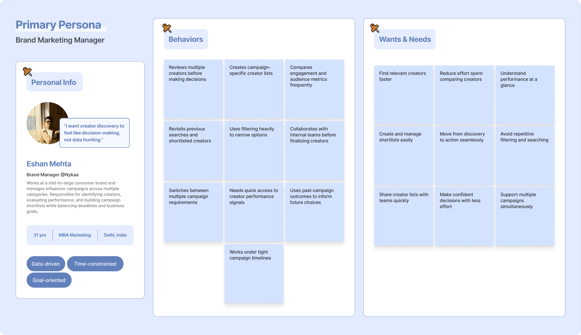
research & insights | persona
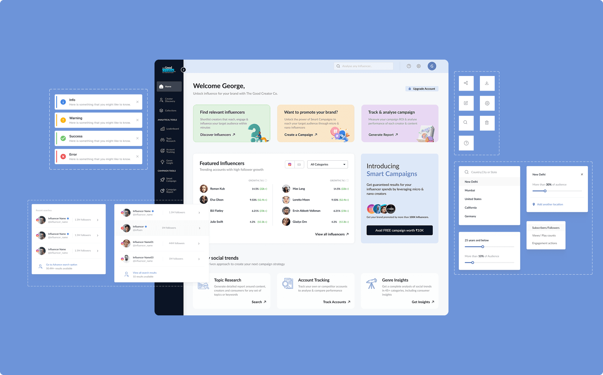
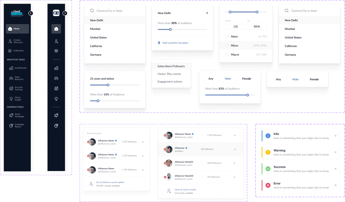
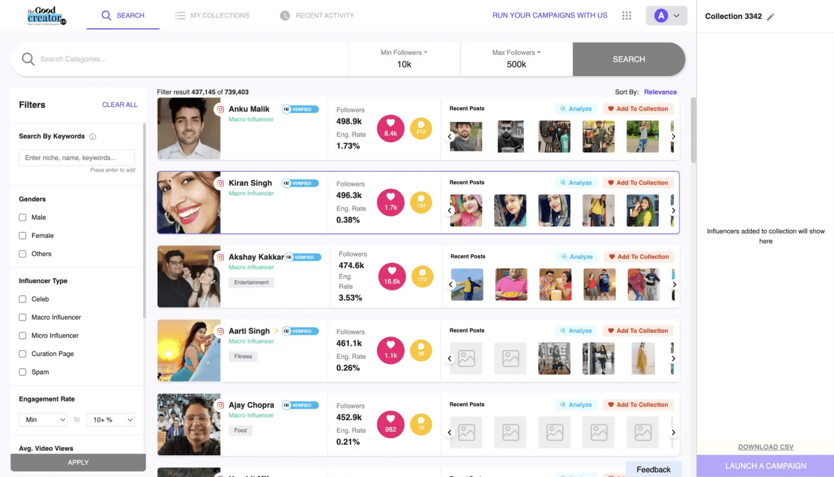
Research & insights | Existing platform UI
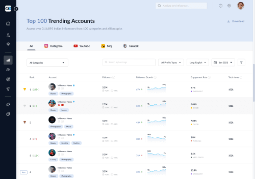
Figure : Existing Experience(Pre-Redesign): Creator discovery page
Weak IA in the navigation
Dense information, weak hierarchy
Unclear metrics and context
Inefficient collection workflow
Rigid and non-adaptive search
Research & insights | insights
Synthesising research findings revealed key gaps in how users interacted with the platform and made decisions.
Users had access to rich data, but struggled to quickly interpret and act on it.
Inconsistent patterns across modules increased cognitive load and reduced efficiency
Core workflows (discovery → evaluation → shortlisting) required unnecessary effort
Lack of structure made the platform harder to scale and harder to learn
First-time users struggled to quickly understand value, especially in a freemium context
STRATEGY | THE PLAN
To address both usability and business challenges, the redesign focused on simplifying core workflows, establishing consistency, and building a scalable foundation for future growth.
1. Improving decision-making with clearer data signals
2. Reducing friction in core user flows
3. Establishing a unified design foundation
4. Enabling a freemium-ready experience
5. Building a scalable design system
User Needs ↔ Business Goals
User Need
Business Goal
Faster discovery
Improve adoption
Clear metrics
Build trust
Easy shortlisting
Increase retention
Guided experience
Support freemium conversion
STRATEGY | design principles

Clarity over density
“Prioritize key metrics”

Progressive disclosure
“Reveal depth gradually”

Action over exploration
“Make shortlisting effortless”

Consistency over variation
“Standardize patterns across the product”
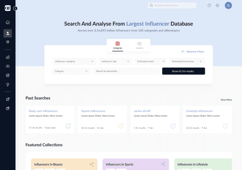
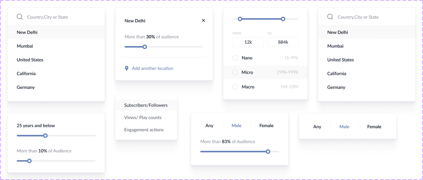
DESIGN | wireframes
Wireframes were used to simplify key workflows and validate structure before moving into high-fidelity design, in close collaboration with the Product Manager.
Adaptive search entry point for quick discovery
Pre-curated collections for quick exploration
Value-led entry points for common use cases
Freemium limit surfacing discovery value while nudging upgrade
Bulk shortlisting as the core user behavior
Flexible filtering supports iterative refinement
Scannable results optimized for quick comparison
Direct search supported, but secondary to discovery-based browsing
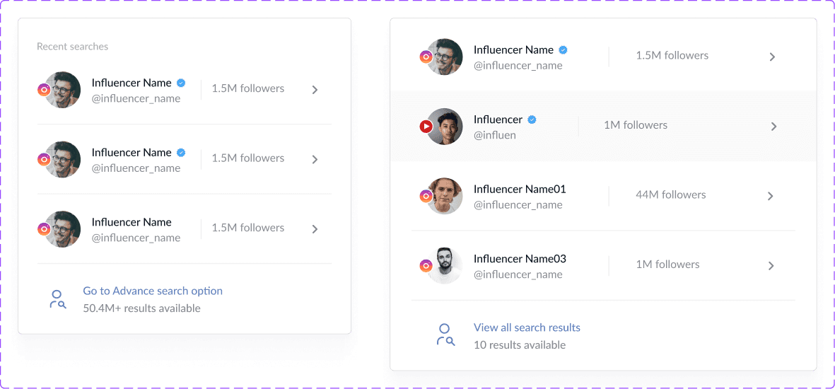
Past searches supporting recall or iteration
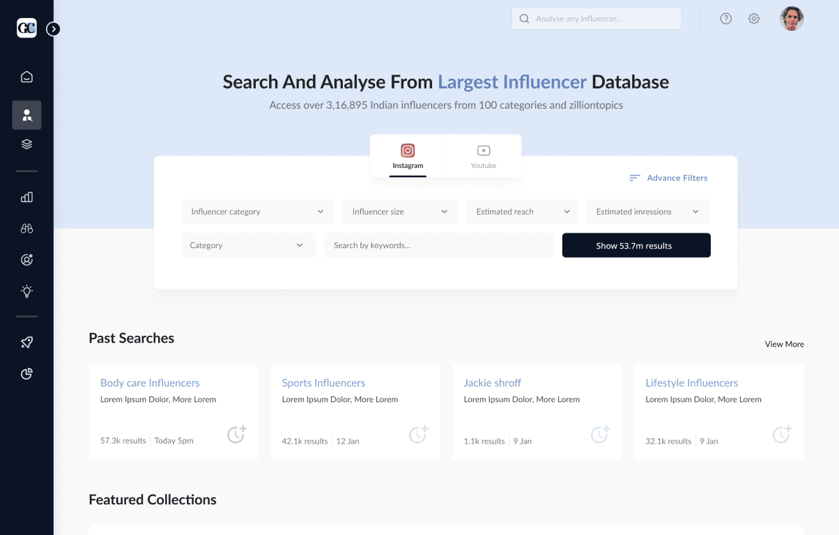
Homepage
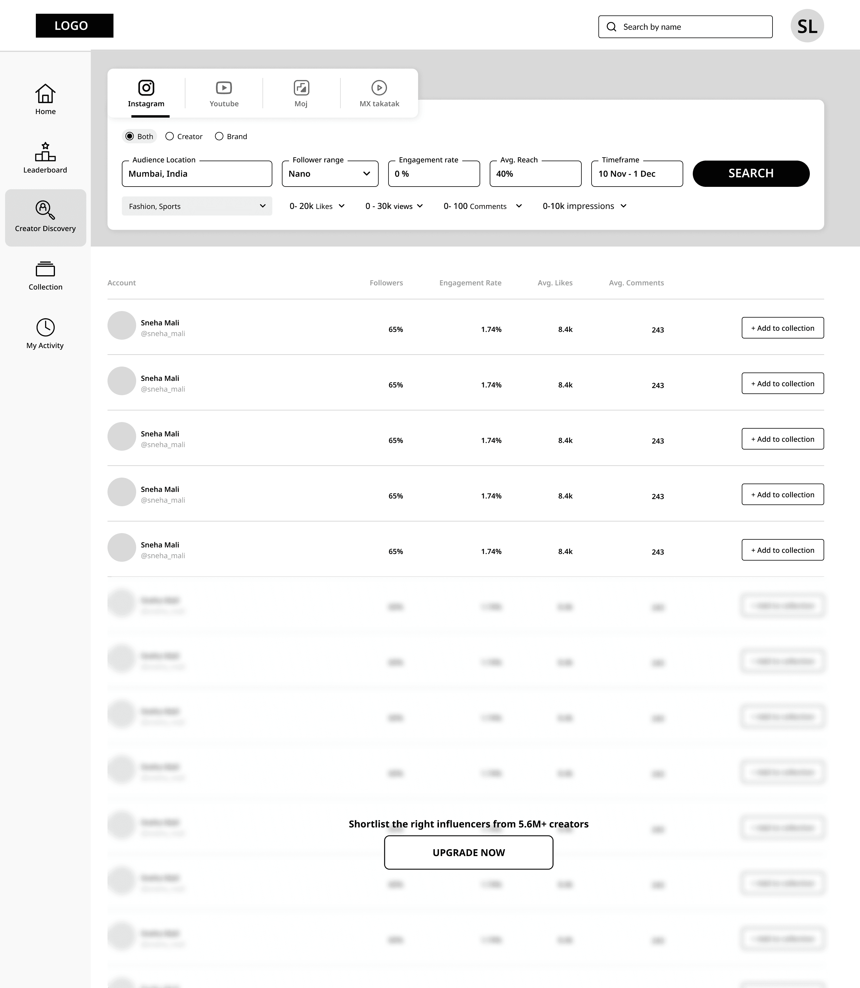
Creator discovery | Default
Creator discovery | Searched
Fig: Creator discovery flow for narrowing down and shortlisting relevant creators
Creator discovery | Searched
later iteration
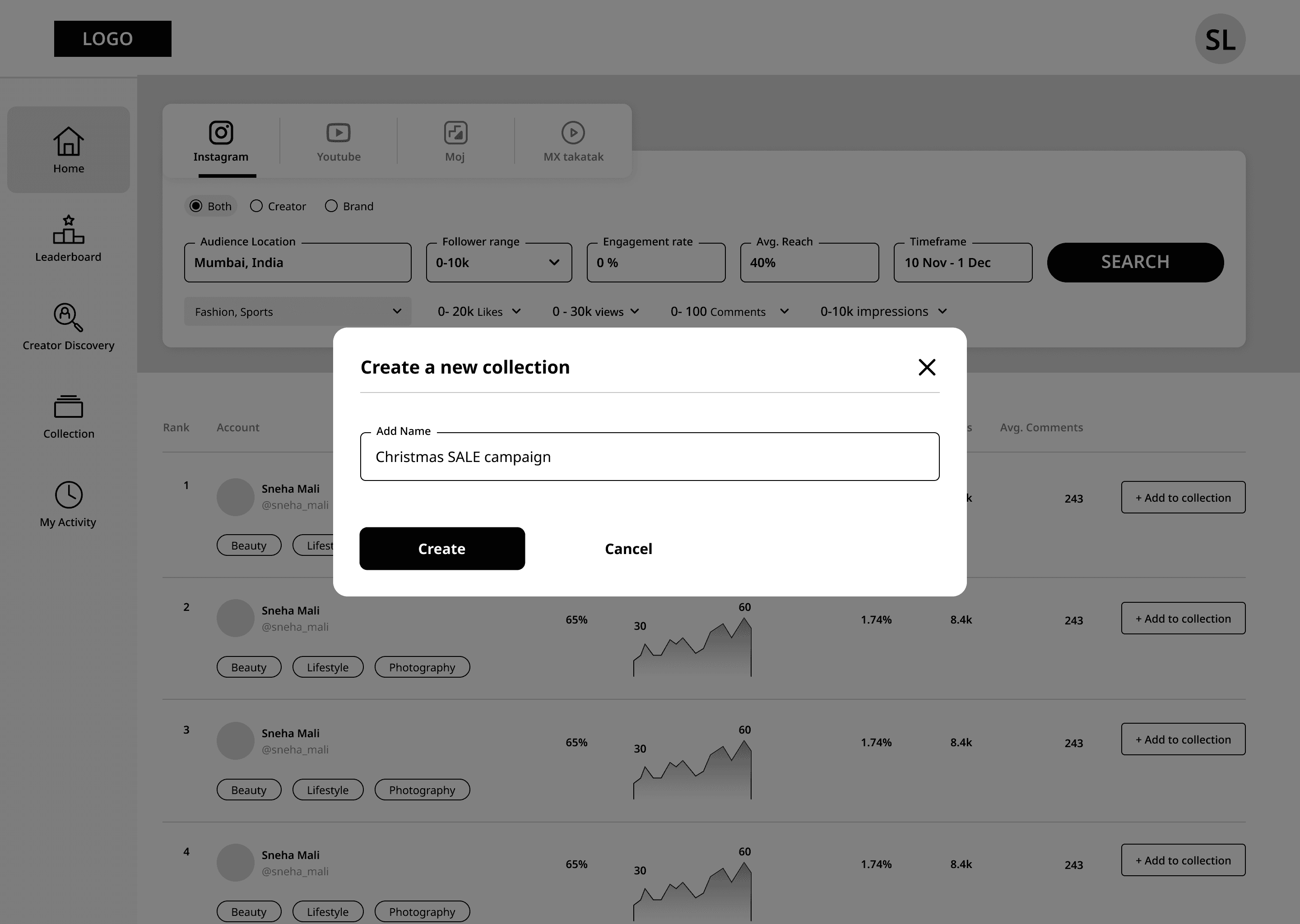
Creator discovery | New Collection/User
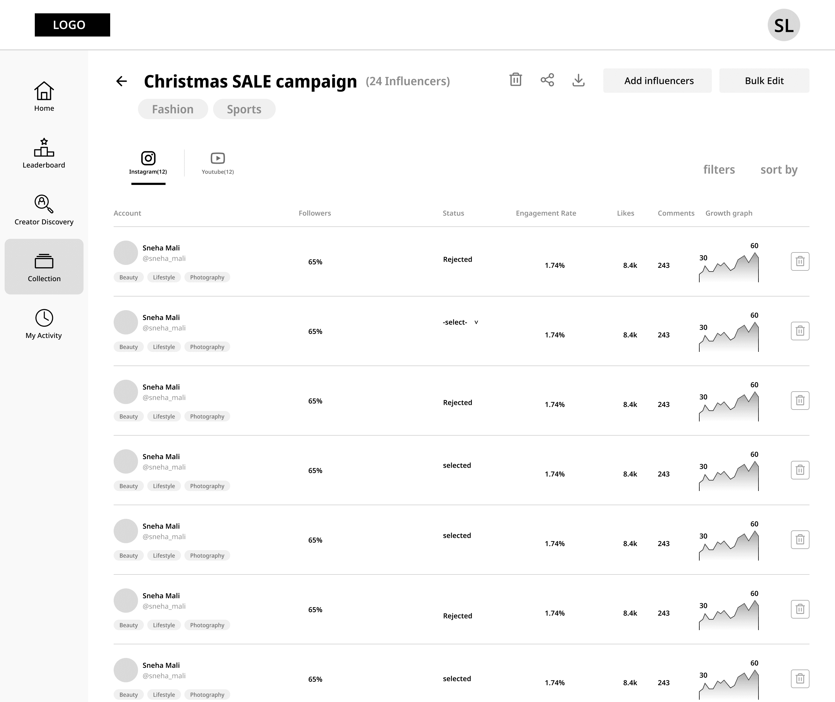
Collection page | Collection
Creator discovery | Add to existing collection
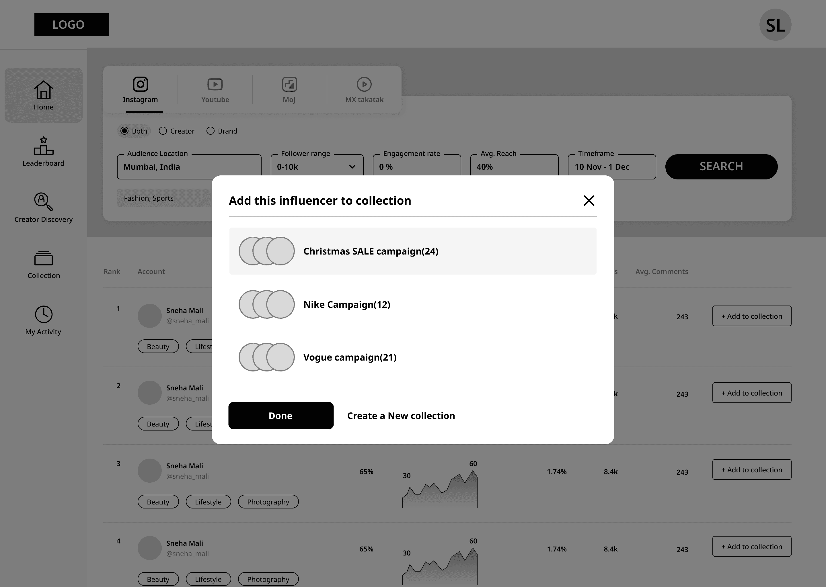
Quick add action enables quick shortlisting
Replaced modal flow with inline feedback(on discovery screen) to reduce interruption and speed up shortlisting
Light creation flow to reduce interruption
Designed for bulk shortlisting and management
Filters and sorting support flexible list refinement
Sharing & export enable easier collaboration across teams
Keeping key metrics visible and clean for users, reducing cognitive load
Allows quick selection across multiple collections
Fig: Shortlisting flow for organizing and managing creators within a campaign
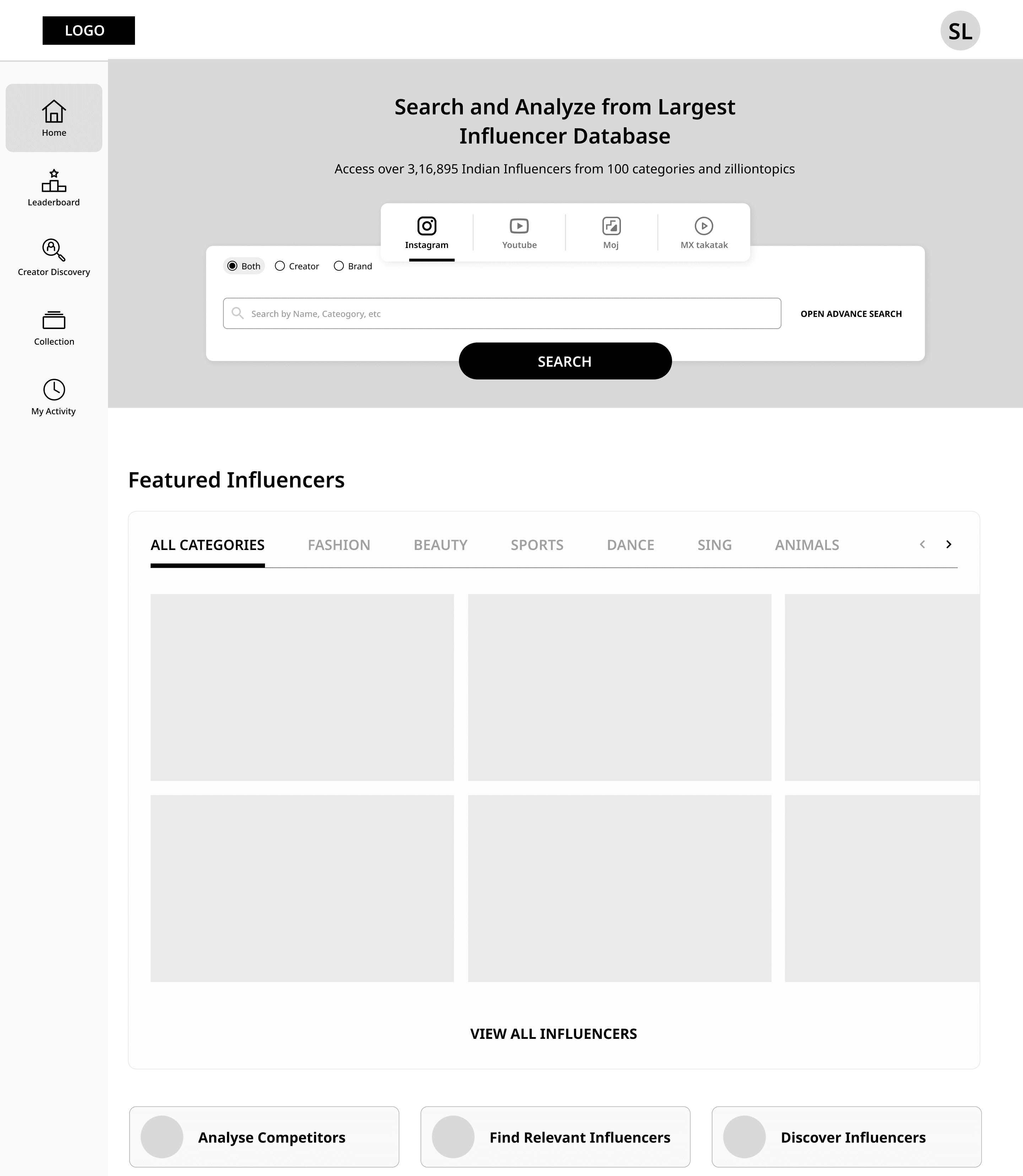
DESIGN | final Design
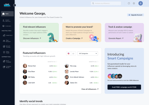
The redesigned experience focused on simplifying discovery, improving decision clarity, and enabling smoother workflows across the platform.
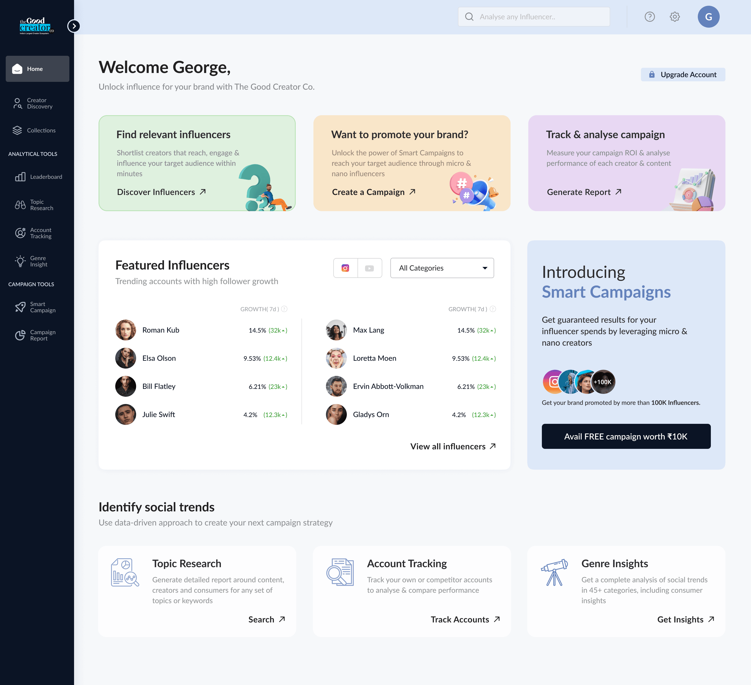
homepage
Redesigning core product flows (discovery → evaluation → shortlisting)
Improving information architecture and navigation structure
Defining new UI patterns and reusable components
Aligning the product with freemium growth strategy
Establishing foundational design guidelines for consistency
view prototype
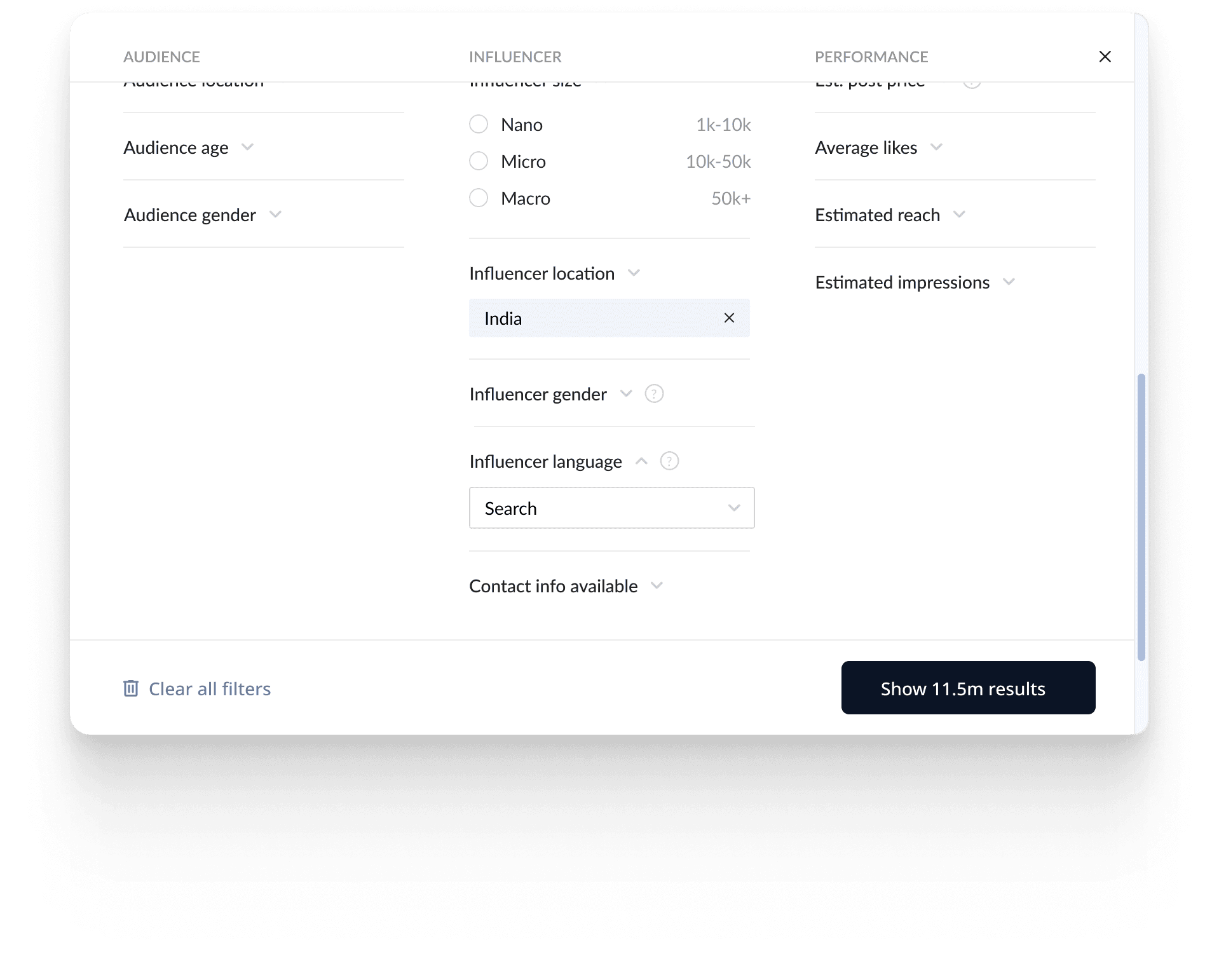
Creator discovery
Simplified filtering
Better scanability of results
Stronger “Add to Collection” actions
Faster shortlisting and reduced friction
view prototype
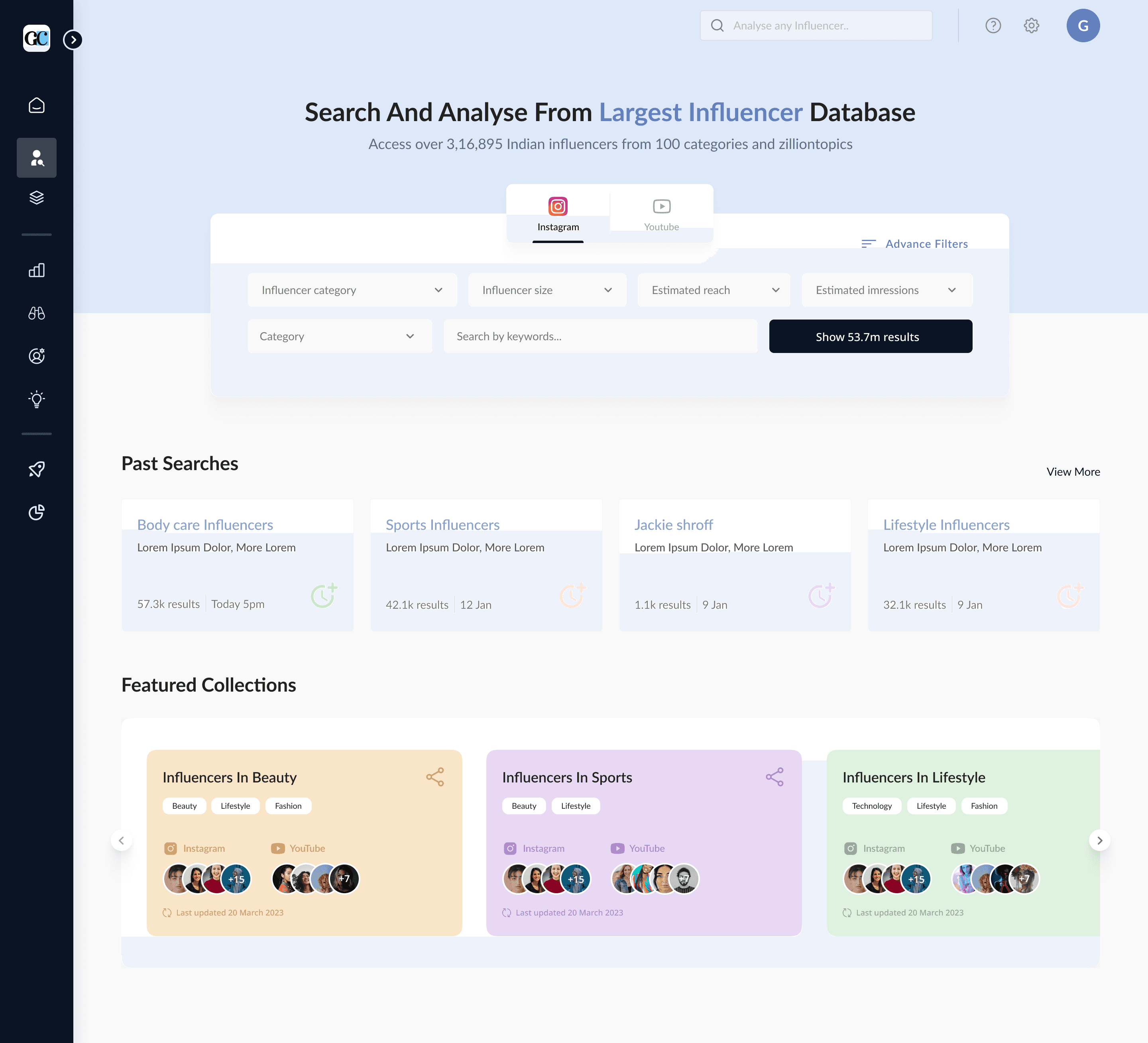
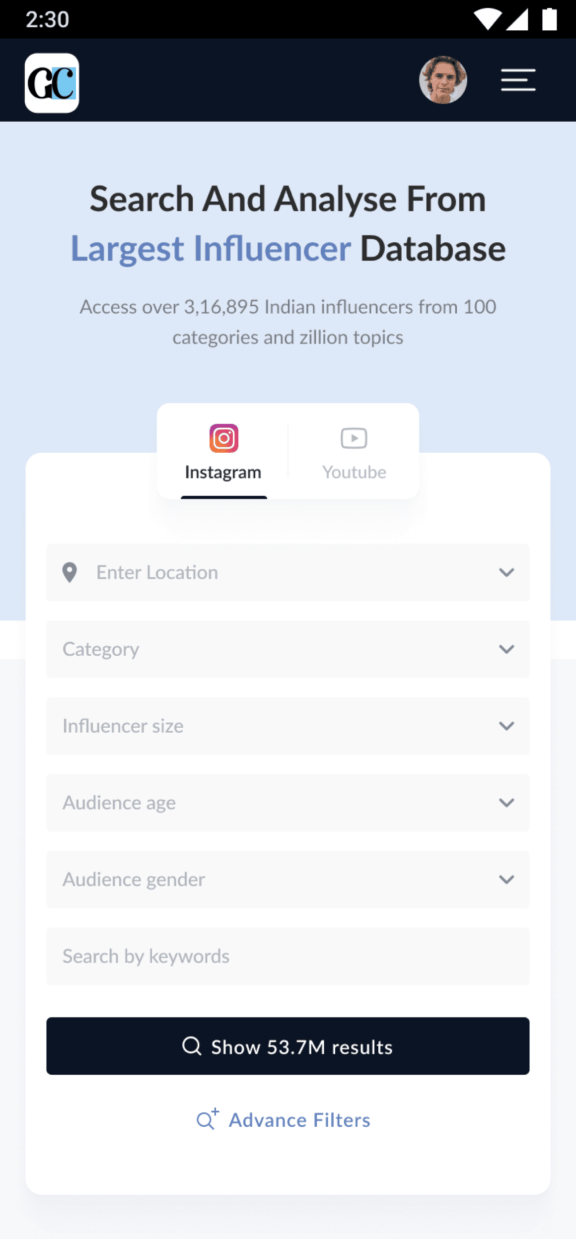
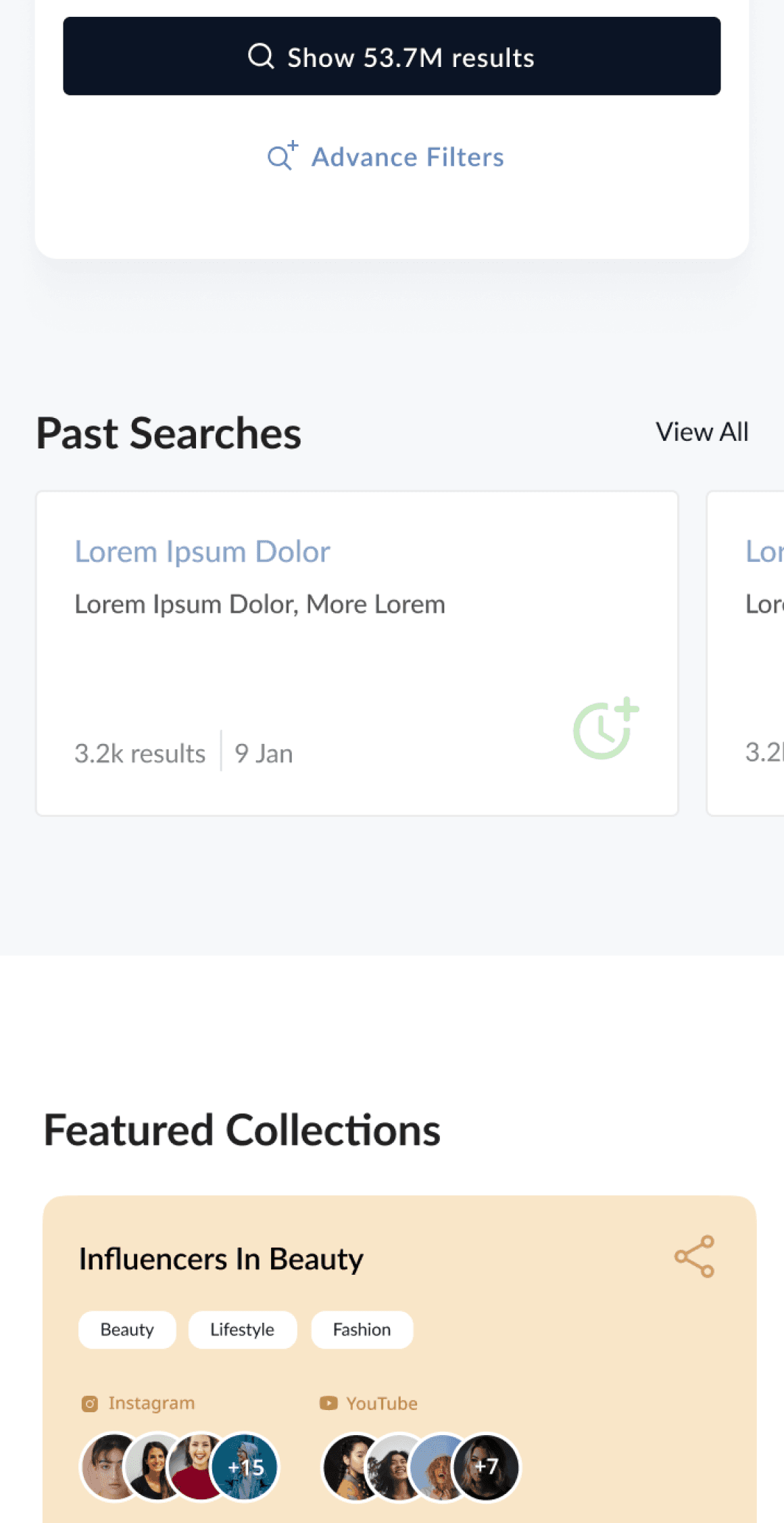

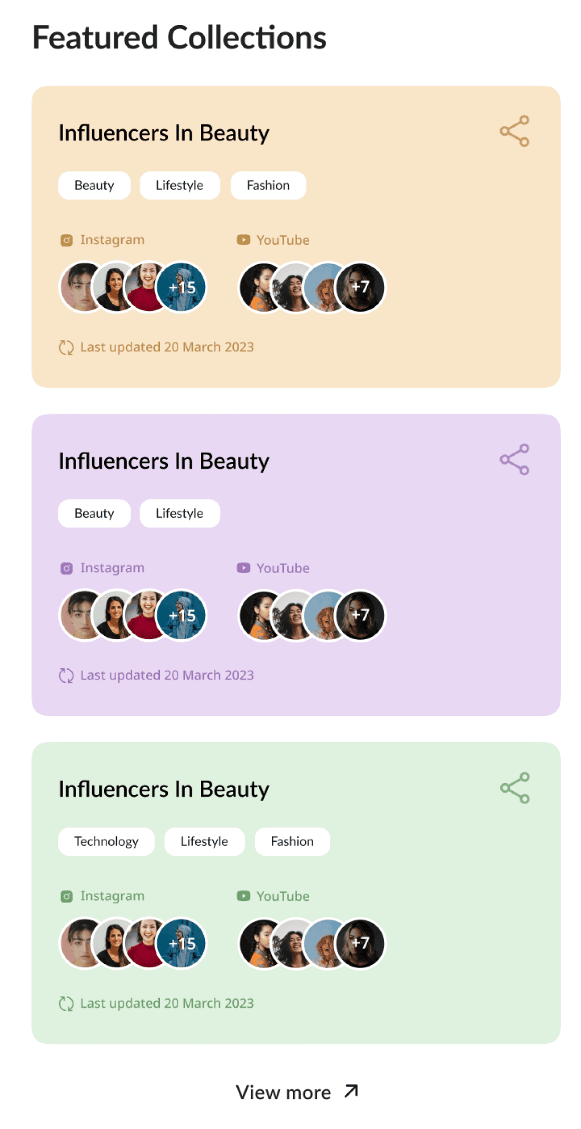
Fig: The mobile responsive layout was made for only homepage, creator discovery and profile in the first phase as the heavy users were primarily using laptops or PCs.
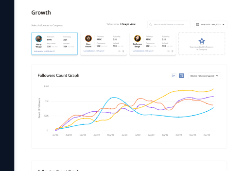
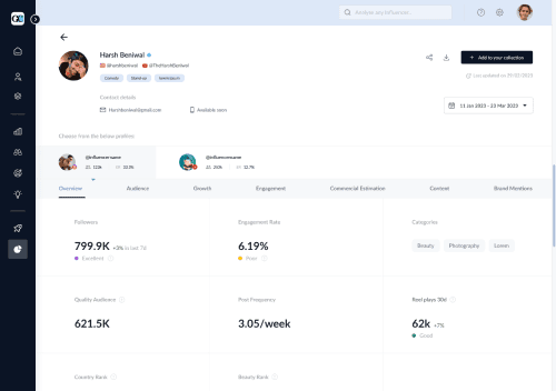
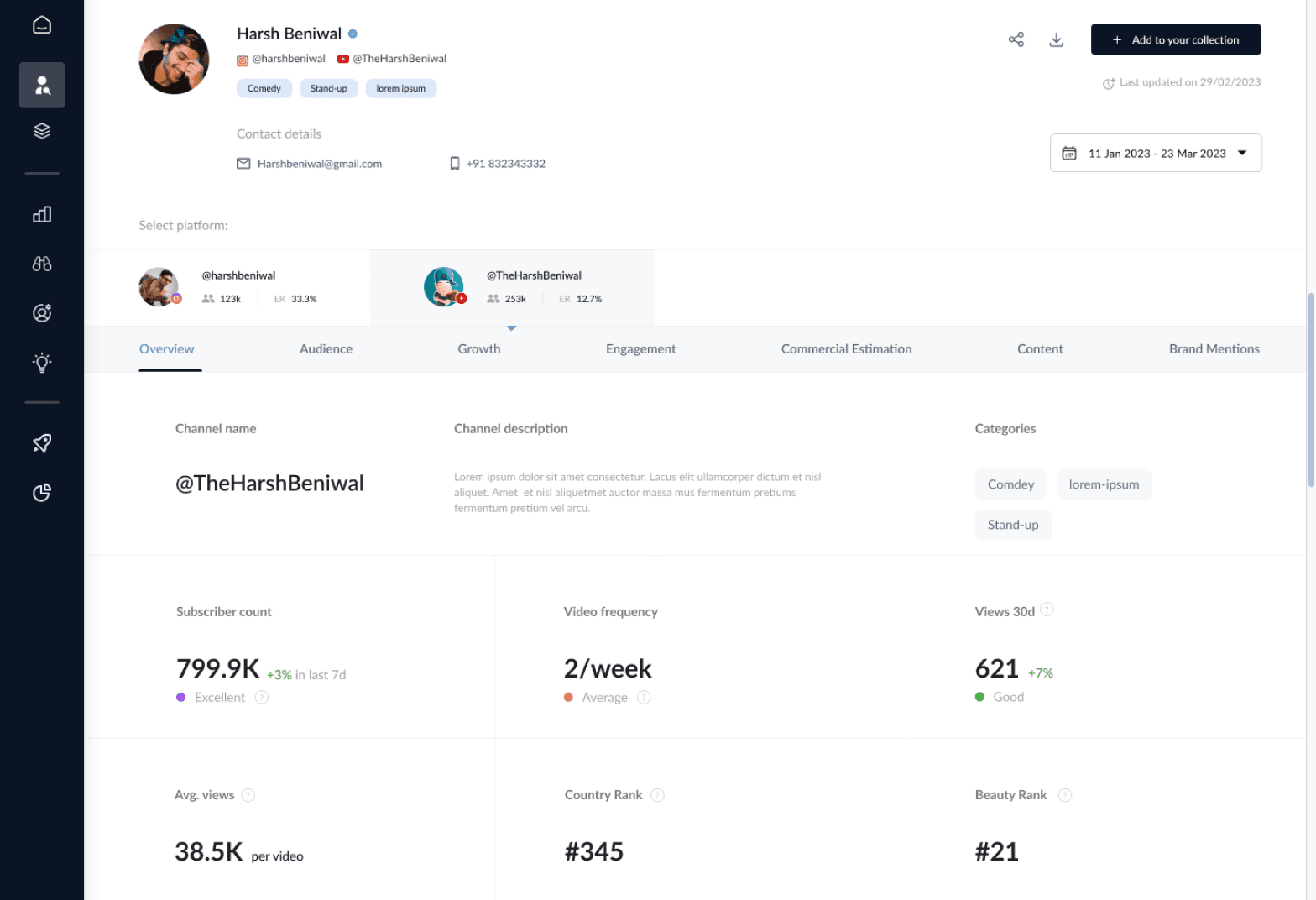
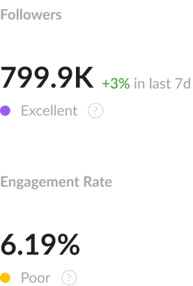
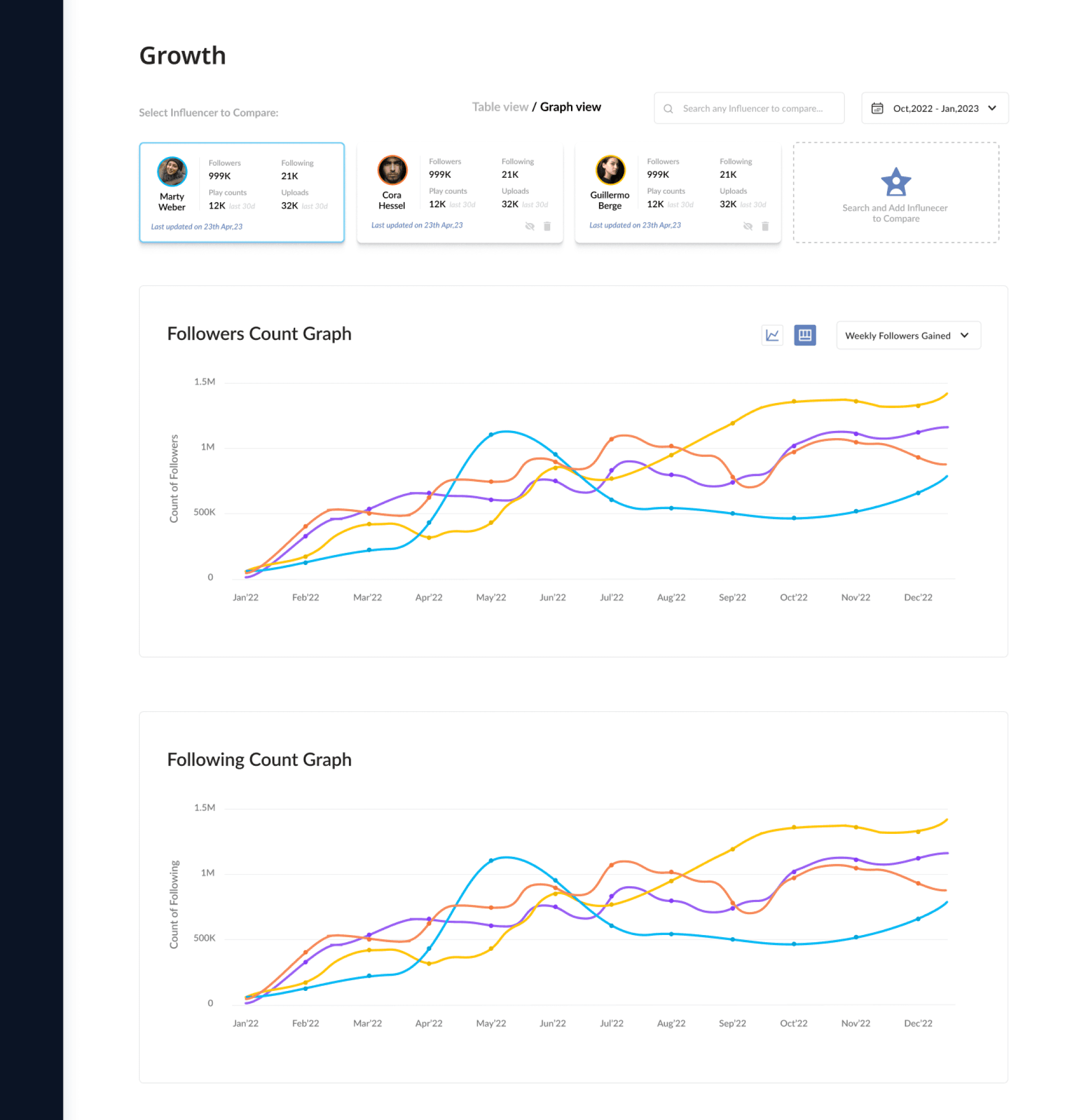
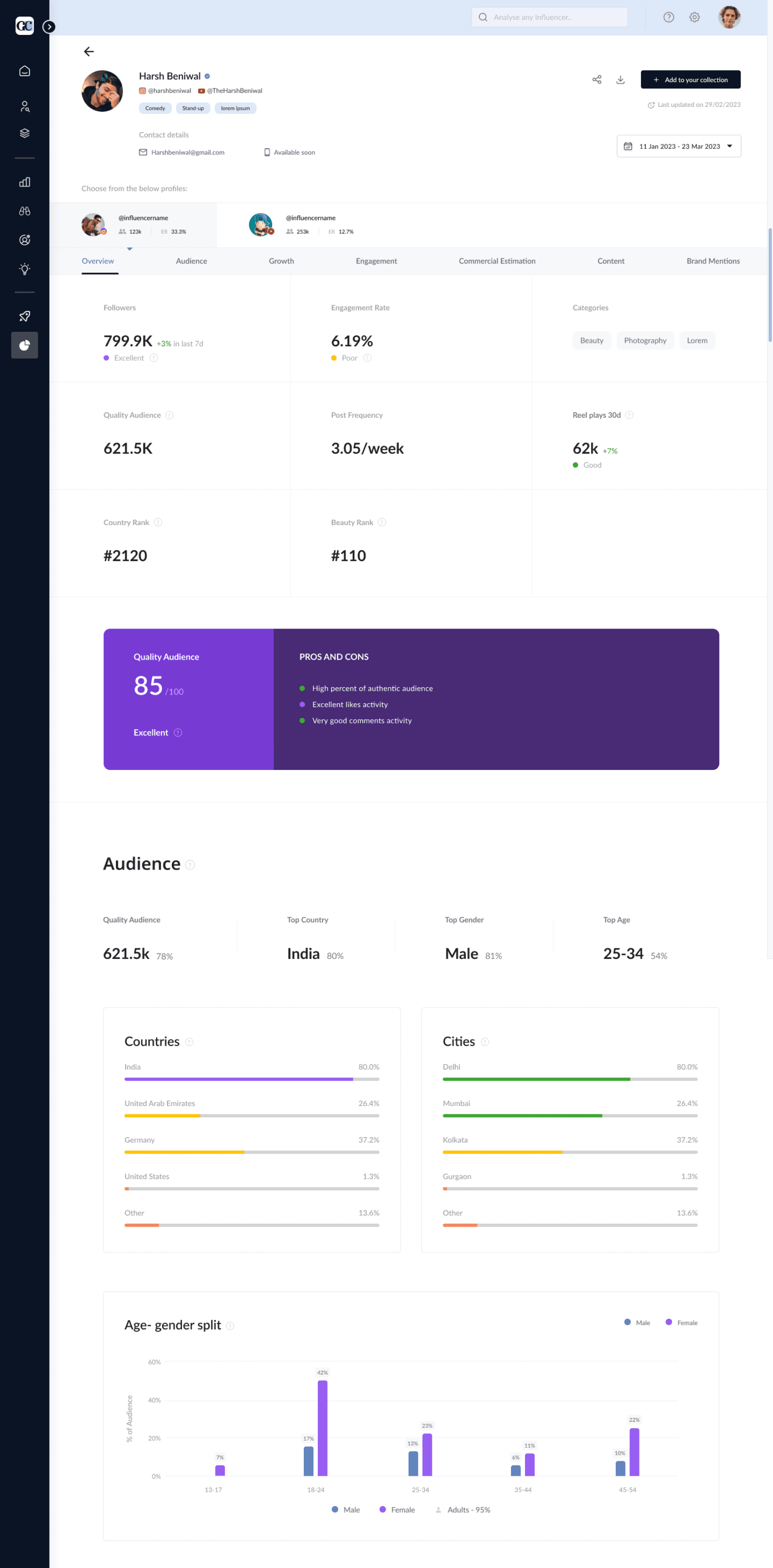
Creator profile
Structured tabs: Overview, Audience, Growth, Engagement, Value
Reduced information overload
Result: Better comprehension and deeper analysis
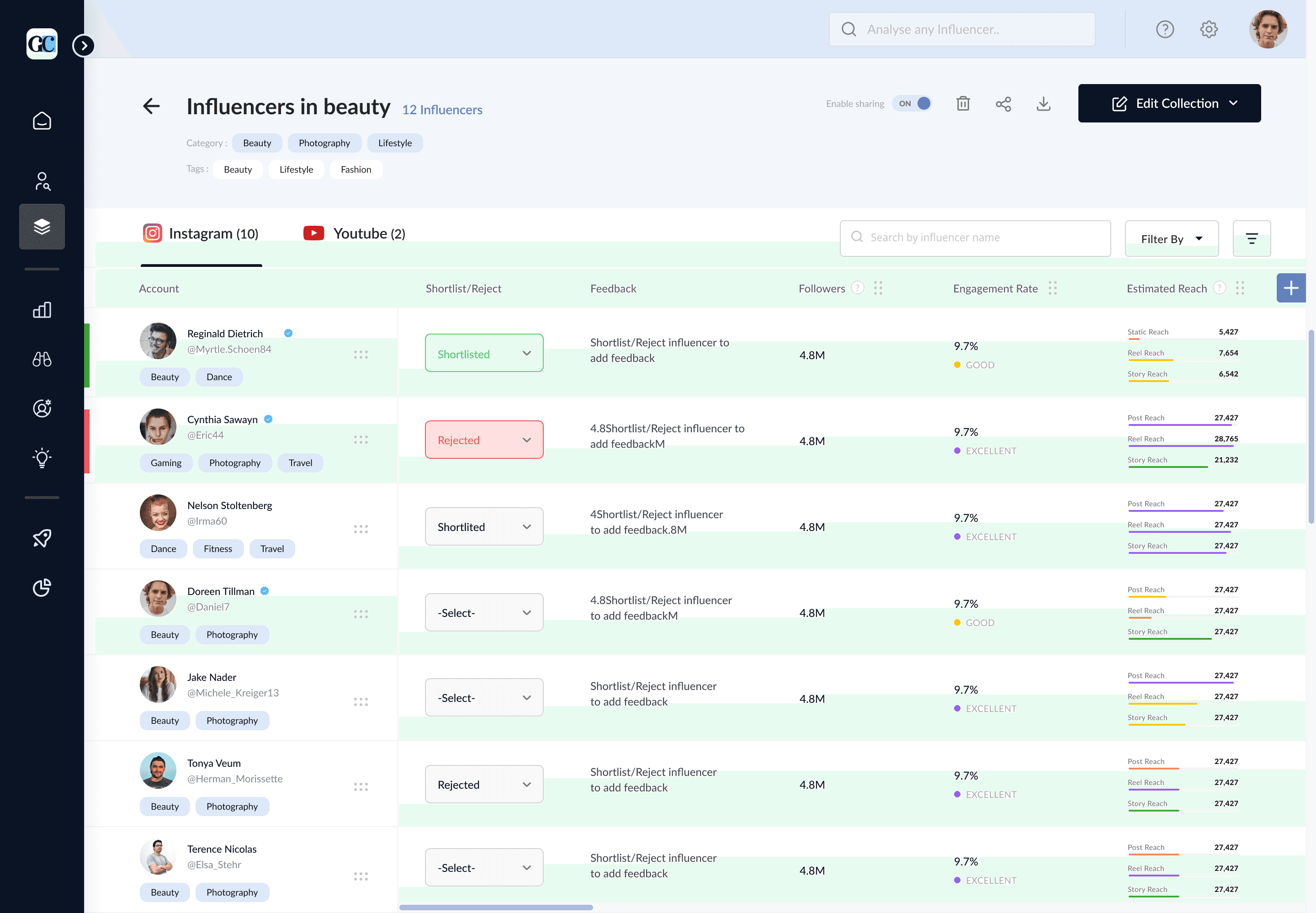
collection
Added shortlist/reject states to make decision status visible at a glance.
Kept key metrics accessible during collection management
Introduced filters and bulk actions for easier refinement and updates
Faster collaboration and more efficient campaign shortlisting
view prototype
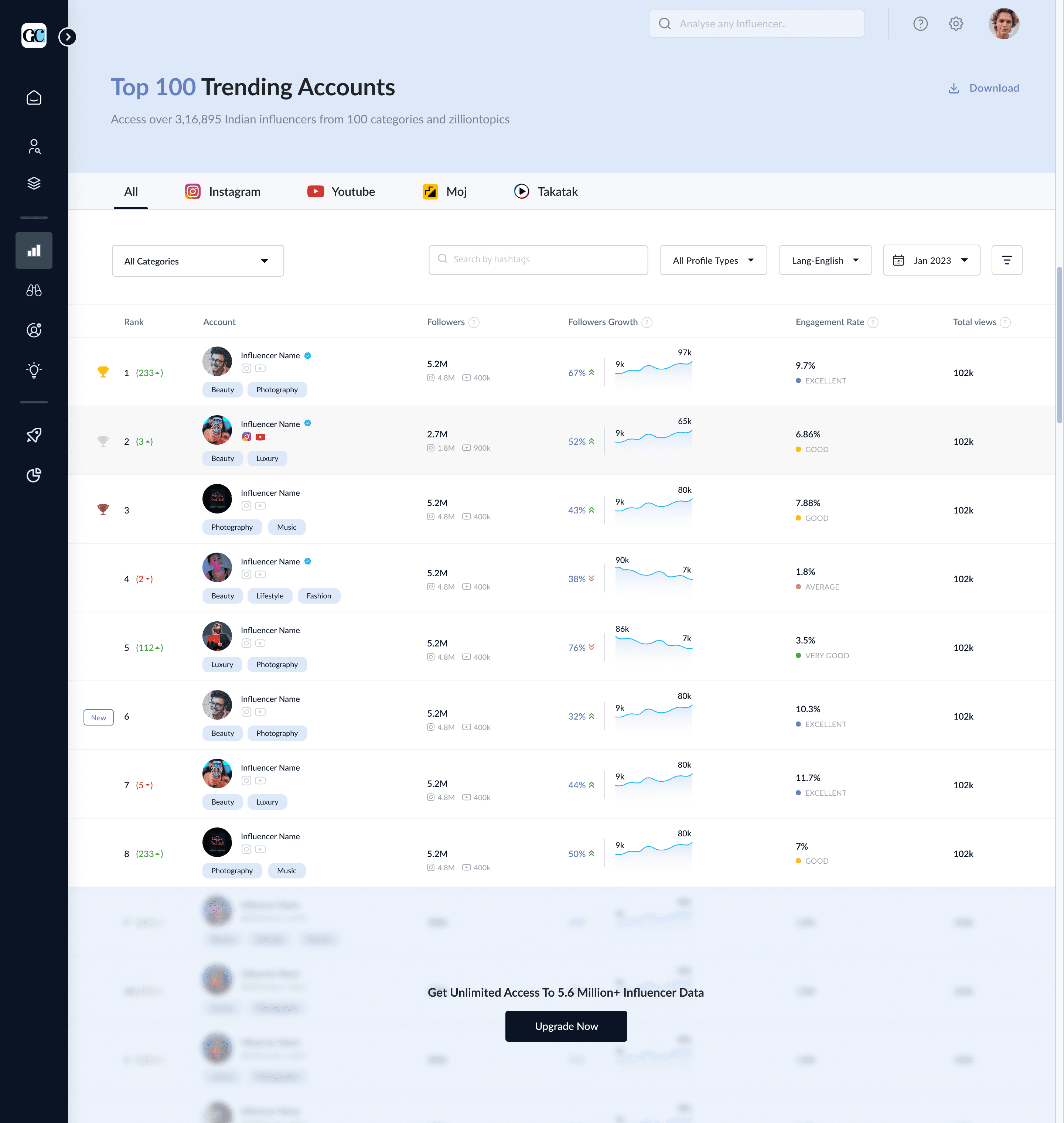
leaderboard
Highlighted top-performing creators across platforms and categories
Structured metrics using clear visual hierarchy and trend indicators
Introduced freemium entry points to encourage deeper exploration
Easier trend discovery and stronger upgrade opportunities
view prototype
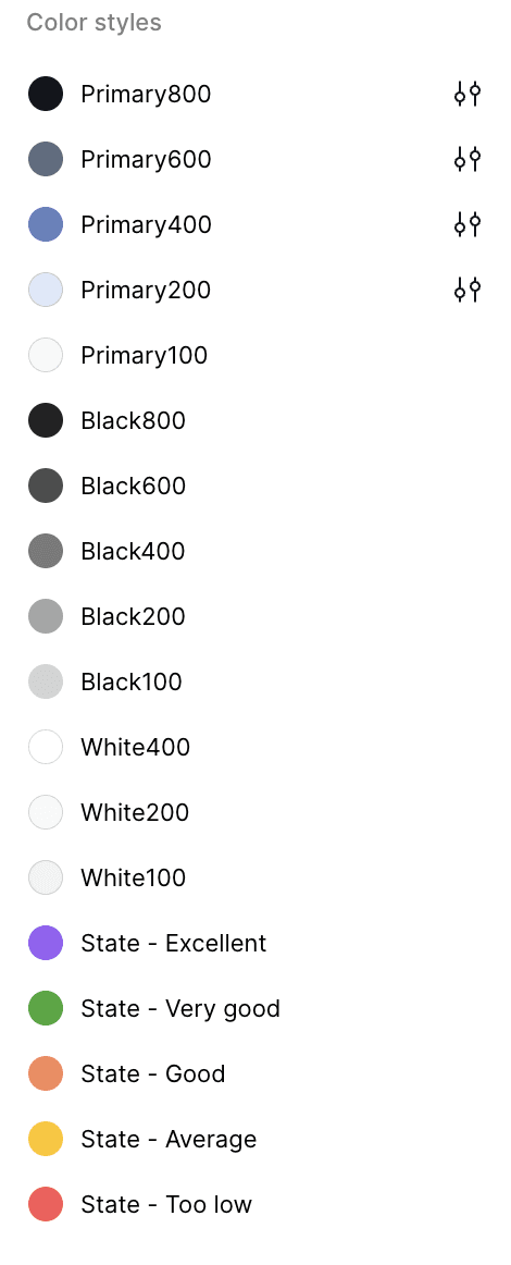
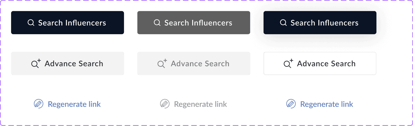
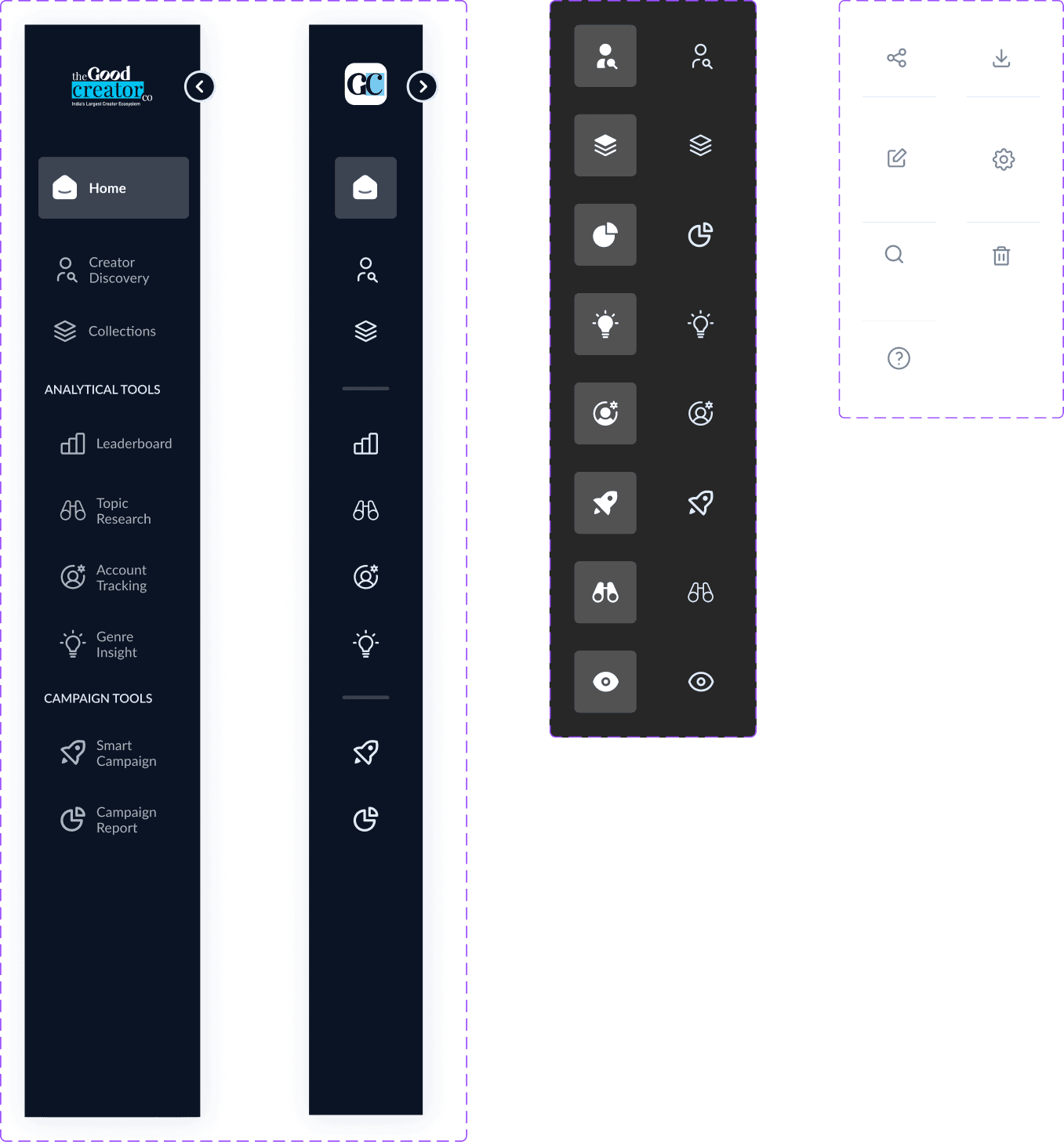
Deisgn | Design system
To support consistency and scalability, I established a foundational Design system.
This included:
22+ Reusable components and 120+ variants
Standardised data visualisation patterns
Defined brand, layout and spacing rules
Unified interaction patterns
" The goal was not just visual consistency, but making the platform feel more predictable and trustworthy.
impact & Learnings | Impact
To evaluate the effectiveness of the redesign, we conducted usability testing with key internal stakeholders across core creator discovery and shortlisting workflows.
How It Was Measured
User
tasks given
8 x sales team members
Discover specific targeted creators
6 x Campaign managers(4+2)
Compare creator profiles
(4 x Internal)
Shortlist creators for campaign
(2 x External)
Share campaign details internally
Behavioural Impact

35% faster creator evaluation

42% fewer steps in key workflows

Increased depth of profile analysis
Business Impact

3 new enterprise clients acquired

Improved sales confidence
“The redesign didn’t just improve usability, it made the platform easier to sell.
Chhitij, PM
impact & Learnings | Collaboration
The redesign was completed within a tight 2-month timeline.
Key challenges were:
Balancing freemium simplicity with enterprise depth
Managing high data complexity
Aligning design decisions with development constraints
Close collaboration with PM and developers ensured feasibility and faster execution.
impact & Learnings | Key takeaways
This was my first experience to design a product from 0-1. There were many thing I got to learn and listed are few of the most important ones. While designing a data heavy SaaS platform:
Clarity drives trust in users.

Designing for freemium is about guiding value, not limiting access
Strong systems thinking is more impactful than isolated UI improvements
Sections